Menu
Color isn’t decoration — it’s psychological manipulation. Brands use it deliberately to control how you feel, think, and buy. Each color triggers a predictable emotional response, and companies exploit these reactions to influence your decisions without you noticing.
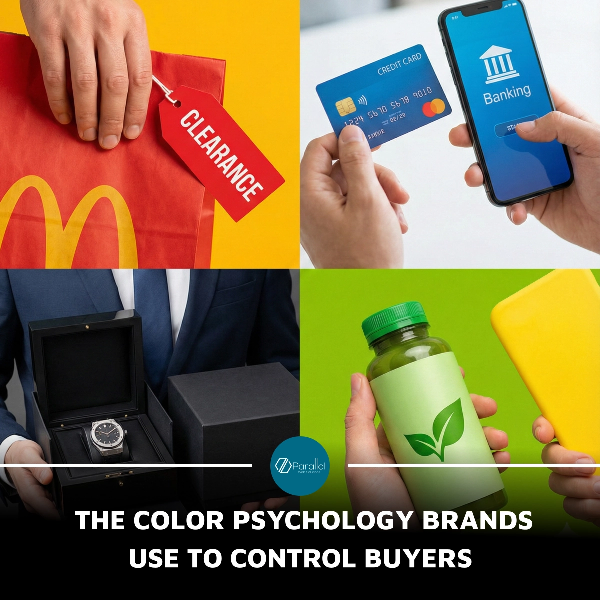
Red creates urgency — that’s why you see it in clearance sales, fast-food chains, and CTA buttons. It spikes your heart rate and triggers impulse buying. Blue builds trust and authority, making it the default for banks, hospitals, and tech brands that want you to feel “safe.” Black signals luxury, power, and exclusivity — ideal for premium products that want you to believe they’re worth more than they actually cost. Yellow grabs attention and stimulates optimism, often used to push you toward quick choices. Green evokes health, calm, and balance, perfect for eco-friendly brands trying to project purity even when it’s just marketing.
These colors bypass rational thinking by influencing your emotional state first. Brands know that emotion drives buying decisions far more than logic. That’s why color psychology is one of their strongest tools — not to help you choose, but to guide you toward the choice they want you to make.
SUMMARY:
#ColorPsychology #BrandingTruths #MarketingManipulation #BuyerBehavior #DesignPsychology #ConsumerInfluence