Menu
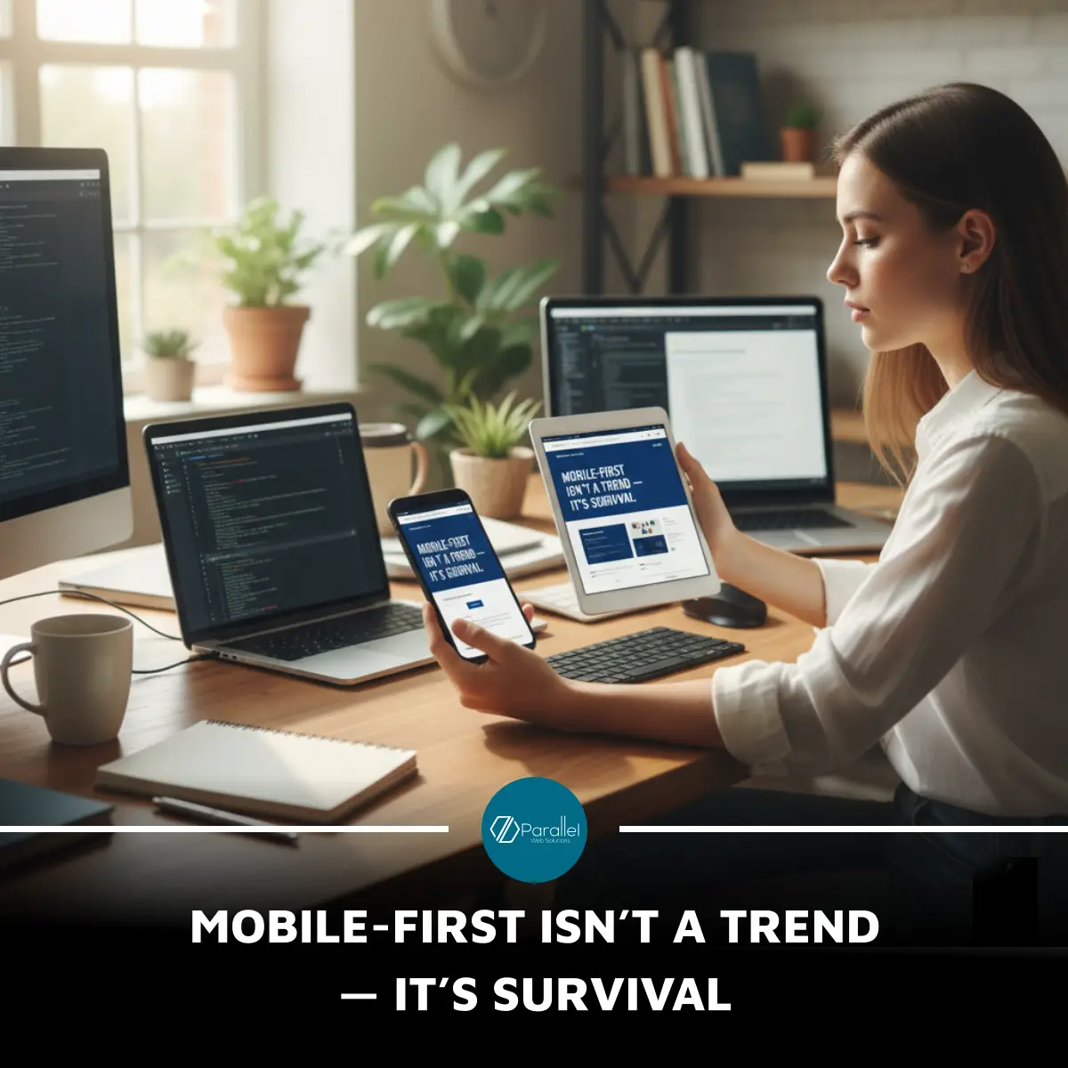
In today’s hyperconnected digital economy, the phrase “mobile-first” is not a buzzword — it’s a business necessity. With over 60% of all website traffic now coming from mobile devices, your customers’ first impression of your brand likely happens on a small screen, not a desktop. In Qatar, where smartphone penetration ranks among the world’s highest, a poorly optimized mobile experience doesn’t just frustrate users — it instantly disqualifies your business from consideration.
A mobile-first design ensures your site loads fast, adapts flawlessly to every screen, and keeps your visitors engaged without pinching or zooming. It’s not only about convenience; it’s about conversion. Google’s mobile-first indexing now prioritizes mobile versions for search ranking, meaning if your site isn’t optimized, it might not even appear where your customers are looking.
For brands like Parallel Web Solutions, mobile-first design means creating seamless, thumb-friendly interfaces that turn casual browsers into loyal customers. The future belongs to businesses that recognize mobile not as a secondary channel, but as the core of their digital ecosystem — where discovery, decision, and purchase all begin.
Summary:
#MobileFirst #UXDesign #ResponsiveWebDesign #DigitalStrategy #ParallelWebSolutions #QatarBusiness